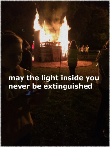
One of the assignments that caught my eye was strikingly simple. Pick a bad photo, apply a vintage effect, and write something in helvetica. It seemed like a brilliant way to highlight how easy it is to make something inspiring. Just make it look like it was meant to have poor quality! The photo I chose essentially had poor lighting and was a bit blurred, making it the perfect candidate for some vintage effects. This time I was able to successfully play around in GIMP, finding a Decor filter called Old Photo. I messed around with the settings and ultimately chose to mottle my photo while neglecting the sepia tone (that would just be a bit too much). As I began inserting my text, I realized that GIMP didn’t have helvetica! Darn it, that was the whole point of the exercise. Luckily some quick internet searches assured me that helvetica is really a form of sans serif, so I opted to use a bolded Sans as a replacement font. I fiddled with various sayings that revolved around the fire/light source that would be long enough to fill two lines across the picture (like the assignment model). Once, completed, I exported my image, and voila! A poor image has been transformed into an inspiring one.
Honestly, this exercise also demonstrates the need for caution/discernment when examining images on the internet. I’ve come across similar “inspiring” photos, and its important to note that minimal thought may have been put into them (as this exercise demonstrated). Be careful before taking life advice from the internet!
