Week 5 Summary

This week was a fun foray into the intricacies and intent behind design.  We began by reflecting on various resources and examples that emphasized the importance of meaning, emotion, and memory when beginning the design process.  We then moved on to exploring design for ourselves.  Since I don’t have a great deal of experience with visual design, I chose to do many smaller assignments to ease myself into the skills and mindset needed.  I examined my own identity through designing my hypothetical biography.  I then explored the various images and associations that one makes in conjunction with different words.  Later I was able to examine the centrality of certain film plot points and play with the dialogue of a screenshot to drastically change the implications for the movie in question.  I also tinkered with medieval tapestry design, applying this older style to a more modern series’ narrative.  And finally, I took a book title out of context to turn a classic story into a horror story.  These were a fun set of exercises that helped cement the connection between design and meaning.

Other design exercises included reexamining Show Your Work in the context of design.  This allowed us to review the importance of documenting our creative process (an important aspect of this class) while also allowing us to see how design can be used to aid one’s argument.  We also searched for various design concepts in everyday advertisements and objects during the designblitz.  This was a particularly fun assignment that allowed us to connect these ideas to our everyday lives.

Finally, the daily creates were very photo-centric this week, allowing us to further examine the importance of visuals and design.


Designblitz

They symbolism of the Wonder Woman system is what makes it iconic.  The clear W shape naturally evokes her name, while the winged ends remind viewers of an eagle, thus closely tying her to American nationalism and her status as a diplomatic envoy to the US.

Wonder Woman Logo

The typography used to depict the name Xena is very interesting.  The capitalization and small spacing gives the name a strong appearance.  In addition, the coloring reminds the viewer of parchment (connecting the name to the shows Greek setting).  Finally, the stroke of the X closely resembles a sword, connecting viewers to Xena’s status as a warrior.

Xena Logo

The form/function/message side of Coppertone water babies is very interesting.  The visual is of a young girl being playfully grabbed by a dog in a reminder of childhood innocence (reminding potential customers that this product is designed for children).  Meanwhile the bathing suit and pink wave design remind customers of a beach scene, which is automatically connected to the sun, and thus, sunscreen.

Coppertone

The X appears to be the dominant feature in germ-X.  Not only does it appear to be the only capitalized letter, but it is bright red in color.  This places the emphasis not on the germs, but on the x, indicating that with this product, you will be getting rid of germs.

germ-x logo

The Horror of To Kill A Mockingbird

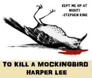
I liked the idea of messing with the meaning of a book title.  Many are symbolic or draw from an important line in the story.  But taken out of context, their meanings may not be clear.  As such, this assignment had me essentially examine classic books with odd titles.  I immediately found To Kill a Mockingbird.  This is a classic story of childhood and race relations, but out of context the title essentially discusses death.  Perhaps it could be interpreted as a suspenseful horror novel?  Subject in hand, I searched for images of dead mockingbirds to create the backdrop for the horror edition of the book.  In advertising the title and author, I specifically used a font (AR DARLING) which evoked a horror feel with its slightly distorted lettering.  I used a related font (AR CENA) for the fake testimonial.  Naturally I used the master of horror, Stephen King, as the one giving Harper Lee praise for her new terrifying novel.  The final product gave me a good laugh, and is featured below.

to-kill-a-mockingbird-alternative-cover

A Xena Tapestry

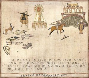
I was inspired by this post to complete the tapestry assignment.  This is essentially an exercise in minimalism, as historically these tapestries had to tell narratives in a somewhat simplistic fashion (after all, these tapestries had to be hand-sewn).  I ultimately chose to try to convey the overarching story of Xena: Warrior Princess through tapestry design.  Xena is the armored figure upon a horse (who somewhat resembles Argo, her steed throughout the series).  Behind her lies the death and destruction of her past (when she was a Grecian warlord).  The standing figure represents Hercules, who put her on her redemptive path, symbolized by the the central sunbeams.  Next to Xena are her fallen weapons, referencing the pilot episode of the series where Xena buries her weapons in a bid to escape her past.  Ahead of her lies Amphipolis and Potidaea, where she will meet Gabrielle (represented by the golden woman) who will be central to cementing Xena’s path to redemption.  Underneath these visuals is a modified quote from Julius Caesar (one of Xena’s main nemeses).  This quote hints at the larger themes of the series, indicating that this redemptive path is part of Xena’s destiny.  The first part of the statement also highlights Xena’s strengths in this context.  The final product is below, and hopefully conveys these themes effectively.

xena-tapestry

Circling Back to Show Your Work!

Well, we’ve come full circle and have returned to exploring the importance of showing your work.  To me this emphasis on documenting one’s process has two main benefits.  For one, it keeps viewers engaged and invested in a creator’s work, as they are essentially teased with progress until the completion of the final product.  However, it also democratizes the creation process.  Communicating and sharing how you complete projects may inspire others to try their hand at it this work.  As such creativity may further more creativity.

From a design standpoint, Kleon uses visuals to break up the text in order to keep readers engaged.  Viewers (especially on e-screens) get tired of looking at blocks of text, so intermingling visually appealing items will help prevent fatigue.  In addition, these images often complement the points Kleon makes in each section.  For instance, there’s a great visual in the 2nd chapter of a swirling scribble with the phrase “Process is Messy,” labeled on it.  This not only makes a statement about accepting messiness, but demonstrates it with a symbolically messy design.  Including these sorts of depictions will help drive home his main messages while also reaching readers who are more visually-minded learners.  Furthermore, Kleon also has pull-out quotes that are more visually orientated to emphasize larger points.  Many of these have asymmetric backgrounds that hearken back to the theme of accepting messiness as a part of the creative process.  Ultimately all of these uses demonstrate how Kleo successfully utilizes design to compliment his work.

Dead Ripley

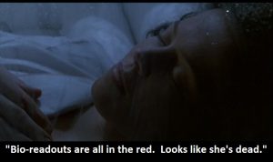
I’m a huge film enthusiast, so I loved the assignment idea of messing with central plot points of movies. What if major events had never happened?  How would this impact the rest of the movie?  I find such questions inherently fascinating, so I had to try my hand at these alterations.  As such, I began combing through my favorite movies, eventually settling on examining Aliens.  I’ve always loved this film.  In fact, it is one of the only movies where I truly think the sequel surpassed the original.  But what if Ripley had never been rescued?  What if she was dead when her pod was discovered?  The rest of the movie would simply never have happened.  So I grabbed a screenshot of Ripley enclosed in her pod, and added an altered version of the dialogue following her discovery.  The result is below.

dead-ripley

Design Reflection

I really appreciated how the Stranger Things article discussed the typographer Ed Benguist.  I was incredibly impressed that he was responsible for the logo for Planet of the Apes, in addition to major logos for The New York Times and Sports Illustrated.  Its amazing how many specialized individuals are connected to major films and publications.  As such, I feel that recognizing their work is very important.  I also liked how the article discussed how design can be connected to memory.  The typography used in Stranger Things was meant to evoke memories of a particular selection of novels from the childhood of the target audience.   This was a great way to emotionally engage prospective viewers with a strategic dosage of nostalgia.

This connection to meaning is reiterated in The Vignelli Canon article.  He reiterates many different points, but I believe it is this emphasis on meaning one that stuck out to me the most.  His reiteration of the fact that vulgar design can essentially be equated to pollution was especially striking.  I also appreciated his argument that design must be understood if is to succeed.  If it does not communicate, it has essentially failed its purpose.  To achieve this understanding and meaning, one requires attention to detail, in addition to strong and impactful design.  He argues that change for the sake of change is unnecessary.  Often a logo is connected to a history.  Change should really be connected to deepening a meaning, not a shallow marketing ploy.

Interestingly, he connected the advent of computers in the design industry as a type of pollution, seeming to see this democratization as a lowering of industry standards.  Honestly I feel like this perspective is somewhat elitist.  While he may be correct that this trend may lower the overall quality, the quantity of work being produced must also mean more quality work exists.  As such, I don’t see how this is necessarily a bad thing.  Different maybe, but not a net negative.  As a final note, this article taught me what justified text is (this always confused me)!

The overall emphasis on this connection to meaning and emotion is also seen in Title Design: The Making of Movie Titles.  For instance, I loved seeing the alternate design for Star Wars, but I immediately thought to myself, “Nope, that’s not right.”  That emotional reaction reiterates the importance of meaning in design.  I connect the traditional Star Wars design to childhood memories and nostalgia, and alternate designs, in my mind, are simply not representative of the true Star Wars.  Overall it is this connection to emotion, meaning, and memory that seems to be the central takeaway from these resources.

A Visual Depiction of “Ancient”

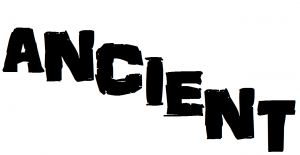
The Word assignment‘s image caught my eye as a visual depiction of “magic”.  The individual letters told a story in addition to the overarching word itself.  The assignment essentially gets the creator to start exploring the visuals that are evoked when we think of certain words.  For my creation, I attempted to visually depict the word “Ancient”.  I picked a font in Paint that had some distortion and areas that were deliberately incompletely filled (AR Darling).  This would ideally evoke older texts and aging materials.  I then started typing the word as I would in a normal word processor, and then began to “sink” the latter letters.  My hope was to create an effect where it looks like as the letters progress, the word begins to sag under the weight of time.

ancient

An Autobiographical Explanation of UvaSEP

I liked that this assignment was essentially about determining which characteristics define you.  So I ultimately went with describing a major aspect of my identity: my digital identity.  I chose to use my avatar as my cover background (this has been my standard avatar for around 4-5 years now).  I chose the title because my YouTube handle is UvaSEP.  This is a very odd username that was automatically derived from my first email.  This email was created for me at UVA’s Summer Enrichment Program.  It is completely arbitrary.  Yet my YouTube channel has almost 100,000 views, and this is the name my viewers know me by.  It’s a curious phenomenon, and one that I have simply procrastinated addressing.  As such, I figured its an odd enough situation to make an intriguing title that may potentially draw hypothetical readers in, while also referencing an important part of my life (namely video-editing).  The final product is below.

autobiography

Week 4 Summary

This week really emphasized the important role that sound has in contributing to storytelling.  A lot of this week’s assignments were practical, either encouraging us to engage with and discuss media or directly interact with it.  We were also exposed to ds106 radio, which was a fun resource that I wasn’t particularly familiar with before this week.  Live-tweeting was also a great way to engage with the larger ds106 community.  Getting exposure to the types of shows that are broadcast also helped me with the development of radio show ideas for the upcoming project.  I also really enjoyed getting to create a radio bumper for the station, which was a fun way to practically mess around with narration and music in a quick mix.  All of my thoughts on this week’s resources can be seen in my audio reflection post.

The assignments really encouraged us to mess around with pieces of sound in order to understand how its structure contributes to a certain atmosphere/tone.  This was especially apparent in the dramatic reading assignment (which essentially focused on how emphasis and tone can change the meaning of a piece) and the slow-mo song assignment.  This last assignment in particular was somewhat challenging, mostly from simply attempting to gather the media to edit in the first place.  MPEG streamclip wasn’t working, so I eventually had to resort to a direct download from YouTube.  Luckily I’m somewhat familiar with Audacity, which made the majority of this week’s work much easier.  The Familiar Sounds assignment also reinforced the importance of maintaining a sense skepticism when evaluating any sort of information, while also allowing us to see how a story can be constructed from ordinary objects.  Finally, the must-do Sound Effects assignment was a fun way to gain exposure to freesound.org as a means of finding sound effects.  It also reiterated the basics of storytelling while also providing us with an opportunity to practice sound layering with multiple tracks in Audacity.

The daily creates were fun this week, even including some interactions with other daily creates.  I think I especially liked creating an explanation for the phone app icon (as honestly phones look nothing like that image anymore).


Overall this week was a fun way to directly engage and alter media to get a better understanding of audio structure and the properties that come with changing it, while also allowing us to build some practical skills with software such as Audacity.