Google Translate Sings the National Anthem

Browsing through possible assignments, I saw this one, and was immediately reminded of Google Translate Sings.  It’s a fun channel that takes songs, runs them through Google Translate, and then translates them back into English to see what changes ensue (most of which are pretty humorous).  I decided to run our national anthem through Google Translate.  I first began by plugging in the English lyrics, and translating them to Armenian.  I then translated the Armenian results to Norwegian, followed by Spanish, Russian, Japanese, and then back into English.  The results are below.  I think most of the major changes came when having to translate between different alphabet systems, especially in regards to Japanese, which has a very different structure than the original English.  Personally, my favorite section is where it states that we must “overnight document” that our flag was still there.

Oh, you say that you can you can see,
By the light of dawn
We welcome the fact that with pride
Finally, I will flash the dusk.
Who broad stripes and bright stars
For dangerous fight
We saw on the wall
Galant?
And, it lights the rocket red!
Bomb will explode in the air!
Overnight document
That our flag was still there.
Oh, they are the Stars and Stripes are still referred to as the wave
In a free land
And brave of the house.
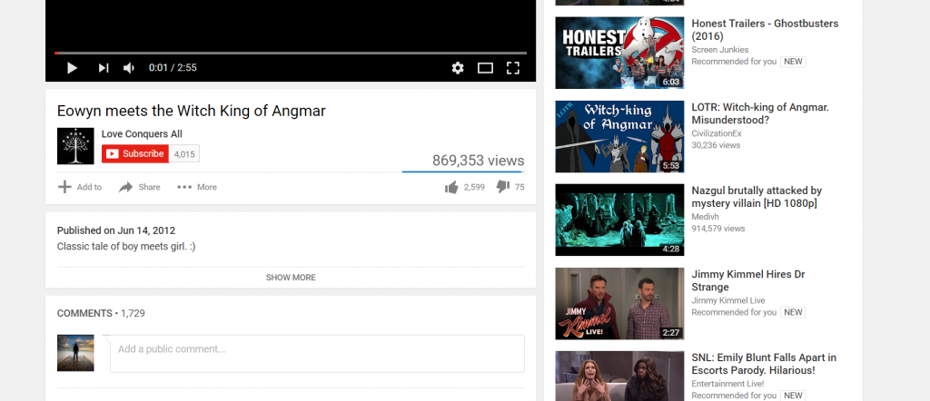
A Pro-Sauron Retelling of LOTR

I’ve really been enjoying fiddling with web pages, so I decided to take X-Ray Goggles to YouTube for this next assignment.  As a Lord of the Rings enthusiast, I decided to alter the video where Eowyn famously declares “I am no man” before stabbing the Witch King.  I changed the description to “Classic tale of boy meets girl” to imply a romance.  In a similar fashion I edited the name of the channel that posted the video.  I also altered most of the LOTR related suggested videos on the righthand side to have a pro-Sauron bent.  For example, I described the Mouth of Sauron as a diplomat who was brutally murdered.  This was another fun exercise demonstrating the power of words and context, in addition to the ease with which the web can be altered.  The full site can be seen here.

remixing-eowyn

Mayonnaise Search

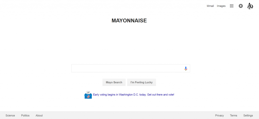
I wanted to experiment some more with X-Ray Goggles so I decided to take on the Personal Search Engine assignment.  I decided to make mine somewhat ridiculous, so… some backstory.  For years I have used the phrase, “Mayonnaise, peanuts, and cucumbers,” as an exclamation of frustration.  “Mayonnaise” for short, when the situation is only minimally frustrating.  So I decided to create the Mayonnaise search, with natural derivations such as Mmail, etc.  I also altered the “I’m feeling lucky” button to give you options such as, “I’m feeling peanuts.”  The hardest alteration was to adjust the name of the search itself, as Google was placed as an image.  Luckily I was able to erase the image and add my title as a heading.  Other personalizations included putting some science and politics search tabs towards the bottom, and being more forceful in encouraging citizens to vote.  Ultimately this was a fun exercise that again emphasized the malleability of the Internet.  The full site can be seen here.

my-search

Wayback When UMW’s Website Was Young…

I was first drawn to this assignment simply by reading the title.  I had heard of the Wayback machine, but had never used it myself.  This seemed like the perfect opportunity to do so!

The first thing to do was select a website to examine.  Originally I considered Wikipedia, but then the idea of examining the school website struck me.  This seemed like a great way to make the assignment especially engaging to other UMW students by using a website that is relevant to them.

In terms of assignment completion, please note that I opted to use the snipping tool to grab my screenshots, as I haven’t yet totally figured out how to use my screenshot option (I’ve used it in the past but forgotten how to use it, as the process isn’t very intuitive on this laptop).

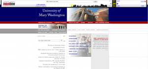
My earliest screenshot was from 2004, and I immediately note the immense amount of white space…

may-20-2004
May 20, 2004

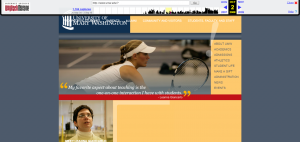
In continuing my search, I kept finding that the website links were covering the background with the school title.  At first I assumed this must be a mistake in the loading of the Wayback Machine.  But this mistake was consistent until late 2010…  Also note Professor Giancarlo!

oct-2-2008
Oct 2, 2008

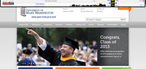
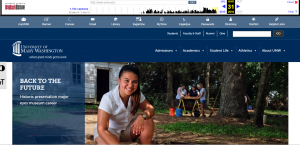
Over time, the link coverage was corrected, and much more color was added, in addition to more dynamic features, such as shifting images (This made it a bit harder to grab screenshots.  At one point I accidentally grabbed one mid-fade!).

may-27-2013
May 27, 2013
aug-31-2016
Aug 31, 2016

Ultimately I think I prefer the modern design to the previous options (though that may simply be because the current site is most familiar to me).  I think its also interesting to note the changing color patterns over time.  Now, excess white space is generally discouraged on most website (a problem of the 2004 version of the site, which was later corrected).  Some color pairings are now considered a bit off (the 2008 grey and orangeish-yellow seems an odd combination to me, and apparently the UMW web designers agreed and thus adjusted in latter versions).  And now more dynamic sites are popular (as seen in the image-shifting 2013 and 2016 versions).  In addition, one can see the new dashboard of the 2016 version, which includes icons as opposed to simple links (again emphasizing the importance of visual richness).  Ultimately I think these changes are consistent with the advice we currently receive regarding keeping websites engaging and user-friendly.