I was first drawn to this assignment simply by reading the title. I had heard of the Wayback machine, but had never used it myself. This seemed like the perfect opportunity to do so!
The first thing to do was select a website to examine. Originally I considered Wikipedia, but then the idea of examining the school website struck me. This seemed like a great way to make the assignment especially engaging to other UMW students by using a website that is relevant to them.
In terms of assignment completion, please note that I opted to use the snipping tool to grab my screenshots, as I haven’t yet totally figured out how to use my screenshot option (I’ve used it in the past but forgotten how to use it, as the process isn’t very intuitive on this laptop).
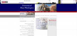
My earliest screenshot was from 2004, and I immediately note the immense amount of white space…

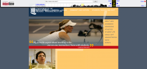
In continuing my search, I kept finding that the website links were covering the background with the school title. At first I assumed this must be a mistake in the loading of the Wayback Machine. But this mistake was consistent until late 2010… Also note Professor Giancarlo!

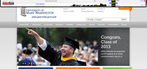
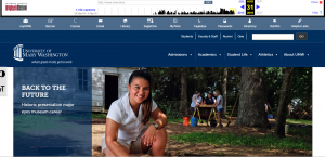
Over time, the link coverage was corrected, and much more color was added, in addition to more dynamic features, such as shifting images (This made it a bit harder to grab screenshots. At one point I accidentally grabbed one mid-fade!).


Ultimately I think I prefer the modern design to the previous options (though that may simply be because the current site is most familiar to me). I think its also interesting to note the changing color patterns over time. Now, excess white space is generally discouraged on most website (a problem of the 2004 version of the site, which was later corrected). Some color pairings are now considered a bit off (the 2008 grey and orangeish-yellow seems an odd combination to me, and apparently the UMW web designers agreed and thus adjusted in latter versions). And now more dynamic sites are popular (as seen in the image-shifting 2013 and 2016 versions). In addition, one can see the new dashboard of the 2016 version, which includes icons as opposed to simple links (again emphasizing the importance of visual richness). Ultimately I think these changes are consistent with the advice we currently receive regarding keeping websites engaging and user-friendly.
Wow how eye opening it is to see how far the internet has come! The 2004 website was so rudimentary!